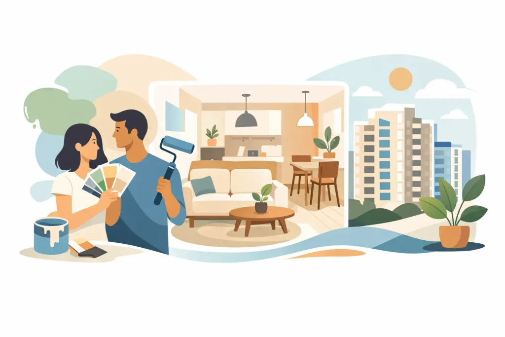
A small HDB can feel tight fast. Low daylight, bulky built-ins, dark flooring, and a compact layout all make wall color work harder than most homeowners expect. If you are choosing the best paint colours for small hdb spaces, the goal is not simply to pick something nice on a sample card. The right color needs to visually open the room, handle Singapore light conditions, and still look clean after daily life.
That is where many paint choices go wrong. A shade that looks bright in the store can turn yellow at home. A trendy gray can flatten a living room. A pure white can feel harsh under cool lighting. Good color selection is less about chasing trends and more about choosing a tone that gives you space, light, and fewer regrets after the job is done.
What makes the best paint colours for small HDB homes work
In smaller flats, wall color does two jobs at once. It reflects available light and it controls how edges are perceived. When walls, ceilings, and trim stay in a close tonal range, the eye reads fewer visual breaks, and the room feels more continuous.
That is why soft, light, low-contrast colors usually perform best. They do not need to be plain. They just need enough warmth or softness to avoid feeling clinical. In practical terms, the best colors for compact HDB bedrooms, living rooms, and hallways are often off-whites, pale greiges, light taupes, muted beiges, and gentle green-grays.
The trade-off is simple. The lighter the color, the more open the space tends to feel, but very light walls can also show scuffs more easily, especially in homes with kids, pets, or frequent furniture movement. Darker feature walls can add personality, but they should be used carefully because they visually shorten space if the room is already tight.
8 best paint colours for small HDB flats
1. Warm white
If you want the safest high-performing option, start here. Warm white reflects light well without the starkness of hospital white. It helps living rooms look cleaner, bedrooms feel calmer, and narrow corridors appear less boxed in.
This works especially well in HDB units with cream tiles, light wood furniture, or warm LEDs. If your home gets limited natural light, warm white is usually a better call than bright pure white.
2. Soft ivory
Soft ivory adds a touch more richness than white but still keeps the space airy. It is a strong choice for older HDB flats where you want brightness without making existing flooring or cabinetry look dated.
Ivory is also forgiving. It hides minor wall imperfections better than stark white, which matters in homes with patched hairline cracks or uneven surfaces.
3. Light greige
Greige sits between gray and beige, and in small spaces that balance can be useful. It gives a modern look without the coldness of flat gray. In compact living rooms, it creates a cleaner backdrop for TV walls, shelving, and built-ins.
But this is where undertone matters. Some greiges lean purple or green under certain lights. Test it on the actual wall before committing to a full repaint.
4. Pale beige
Pale beige is often overlooked because people think it looks old-fashioned. In reality, the right beige can make a small flat feel warm, settled, and more expensive than a basic white wall.
It works particularly well if you have wood-tone furniture, brown curtains, or warm stone-look floors. The key is keeping it light and muted, not yellow-heavy.
5. Light taupe
Taupe adds a little more depth while staying space-friendly. It suits bedrooms where you want softness rather than brightness. In a small HDB bedroom, taupe can feel restful without making the walls close in.
This is a practical option for homeowners who want something more styled than white but still easy to live with for years.
6. Misty gray-green
A very soft gray-green can make a room feel calm and fresh, especially in bedrooms and study corners. It introduces color without shouting for attention.
Done right, this shade pairs well with white trim, oak furniture, and minimal decor. Done wrong, it can turn muddy. So this one depends heavily on lighting and paint finish.
7. Powder blue-gray
For flats that run warm throughout the day, a powder blue-gray can cool the visual temperature without looking icy. It can make a small room feel lighter and more relaxed.
This is best used in bedrooms or one secondary space rather than across the entire home unless the palette is tightly managed. Too much cool blue can make a flat feel less welcoming at night.
8. Blush beige
If you want a soft designer look without going obviously pink, blush beige is worth considering. It adds warmth, flatters skin tones, and gives a bedroom or dressing area a polished feel.
It is not for every homeowner, but in the right flat it looks intentional and premium. Pair it with off-white ceilings and light textiles to keep the room open.
Best paint colours for small HDB rooms by area
Not every room should be treated the same. A color that works beautifully in the bedroom may feel dull in the living room, while a crisp living area shade may feel too bright where you sleep.
Living room
For small HDB living rooms, warm white, soft ivory, and light greige are the most reliable choices. These shades bounce light, make seating areas feel less crowded, and work with most flooring types.
If the room includes a dining corner or open kitchen view, keeping the main walls in one light shade helps the whole area feel larger. Too many color changes break up the layout and make the flat feel smaller.
Bedroom
Bedrooms can take slightly softer or deeper tones because the goal is comfort as much as openness. Light taupe, pale beige, and misty gray-green usually perform well here.
If your room is very compact, paint all four walls in the same shade instead of creating a dark accent wall behind the bed. Accent walls are popular, but they often make small rooms feel shorter.
Hallway and entry
These spaces often get the least light and the most traffic. Warm white or soft ivory usually makes the most sense. They keep the path through the flat bright and help the home feel cleaner from the moment you step in.
Kitchen and service areas
For areas that need to feel fresh and easy to maintain, lighter neutrals still win. A washable finish matters just as much as color here because grease, moisture, and regular cleaning will test the paint more than a bedroom wall ever will.
How to choose the right shade without wasting time or money
The fastest way to make a bad paint decision is to choose from a tiny fan deck under store lighting. Color behaves differently depending on window direction, bulb temperature, tile color, and the amount of shadow in the room.
A practical selection process is simple. First, decide the mood you want – brighter, warmer, cleaner, or softer. Second, narrow to two or three light shades in that range. Third, test them on the actual walls and check them in morning, afternoon, and night lighting.
Finish matters too. For most small HDB interiors, a low-sheen or washable matte finish gives a cleaner look because it reduces glare and helps hide minor wall imperfections. Higher sheen can reflect more light, but it also highlights patching, unevenness, and roller marks.
This is also where professional prep makes a visible difference. Even the best color will look average on poorly prepared walls. Crack patching, sealing, and even coverage are what make light paint look smooth instead of streaky.
Common mistakes that make a small HDB look smaller
The first mistake is going too dark across too many walls. Deep colors can look rich, but in compact flats they absorb light fast. Unless the room has strong natural light and enough floor area, they usually reduce the sense of space.
The second mistake is choosing a white that is too stark. Under cool LEDs, harsh white can feel sterile and expose every surface flaw. Most homeowners are happier with a softened white that still reads clean.
The third mistake is mixing too many shades from room to room. A small HDB benefits from continuity. When every room changes color dramatically, the layout feels more fragmented.
The fourth mistake is focusing only on the paint card and not the execution. Fast, clean, controlled painting matters. If furniture protection, patching, edge work, and cleanup are weak, the final result will never feel premium no matter how expensive the paint is.
Choosing the best paint colours for small hdb homes is really about making limited space work smarter. Go lighter, stay cohesive, and choose shades that suit your lighting instead of chasing a trend that looked good somewhere else. If you want the result to feel bigger, cleaner, and professionally finished without lifting a finger, the color is only half the job – the workmanship is what makes it believable.