
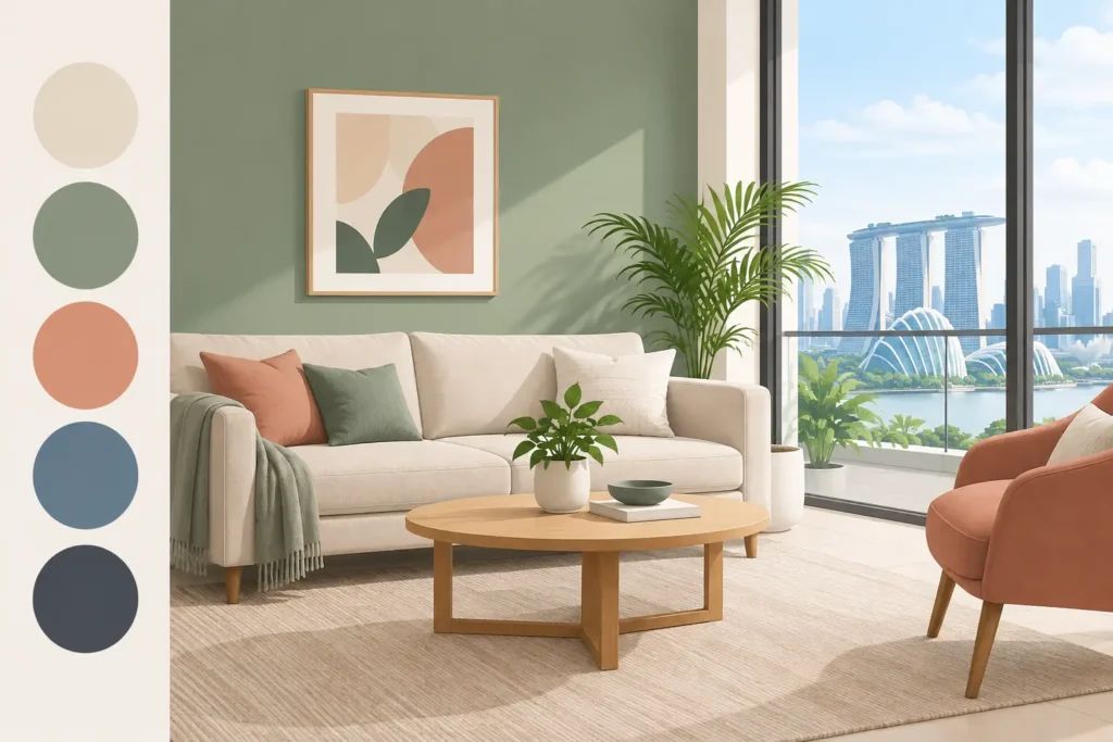
A color chart can make every shade look easy. Your actual home is different: it has daylight from a specific direction, warm or cool artificial lighting, existing tiles, built-in carpentry, and rooms that may need to work hard from morning to night. That is why the most useful colour trends are not simply the shades appearing in show flats or social feeds. They are colors that still look right after the furniture is moved back, the lights are on, and daily life resumes.
For Singapore homeowners, a repaint is often tied to a move-in date, renovation handover, tenancy change, or a long-overdue refresh. The goal is not to chase a look that dates quickly. It is to select a palette that makes the property feel cleaner, more considered, and easier to live with – while allowing the painting work to be completed with minimal disruption.
The color trends worth considering now
The strongest direction is away from stark, one-note interiors and toward softer, grounded color. Clean white remains a practical option, especially for rental units and compact HDB flats, but it is being used with warmer supporting tones rather than as the only answer. Think soft stone, mushroom, warm gray, muted sand, gentle clay, dusty blue, and foliage-inspired green.
These shades work because they respond well to the way many Singapore homes are used. They can make a bright living room feel less glaring at noon, soften the look of large-format tiles, and give a bedroom a calmer atmosphere without making it feel dark. They also sit comfortably beside common finishes such as light oak vinyl flooring, white cabinetry, black fixtures, and gray stone-look surfaces.
Trend-led does not have to mean dramatic. A well-chosen warm neutral across the main living areas, paired with one restrained feature wall, usually delivers a more lasting result than applying several bold colors in small rooms. The best palette depends on your unit’s light, layout, and furnishings, not just what is popular this season.
Warm neutrals are replacing cold gray
Cool gray had a long run because it looked modern and easy to match. The problem is that some grays can feel flat, bluish, or clinical under cool LED lighting. Warm off-whites, taupes, putty tones, and soft beige-grays are now the more flexible alternative.
For an HDB living room, a warm neutral can create a brighter, more welcoming base without the yellow cast that homeowners often worry about. In a condominium with darker flooring or large windows, it can balance the contrast between strong daylight and shaded corners. The key is undertone. A beige with too much pink may clash with gray tiles, while a gray with too much green may look dull beside warm wood carpentry.
Paint should be viewed on the actual wall, not selected from a tiny swatch alone. A professional color consultation should include checking the shade in daytime and under the lights you use at night.
Earth colors bring character without visual clutter
Muted terracotta, clay, cinnamon, olive, moss, and deep sand are gaining ground as feature colors. They offer more personality than gray while remaining easier to live with than intense red, orange, or bright green.
A clay-toned dining wall can add warmth to a neutral home. A softened olive behind a bedhead can make a bedroom feel more settled. In a home office, a desaturated green or blue can give the room definition without becoming distracting on video calls.
There is a trade-off. Deep earth colors absorb light, so they need careful placement in narrow corridors, low-light bedrooms, and smaller kitchens. Use them where the wall has purpose: behind a sofa, bed, dining table, or reception desk. Keep adjacent walls lighter so the space retains visual breathing room.
Soft blues and greens suit spaces designed for rest
Blue and green continue to work well in bedrooms, study rooms, and wellness-focused commercial spaces. The current preference is for gray-blue, eucalyptus, sage, and muted sea-green rather than highly saturated shades.
These colors are particularly useful when a room receives strong afternoon sun or feels visually busy due to furniture and storage. A quiet blue-green can settle the space while still giving it identity. For a child’s room, choose a lighter, dustier version that can grow with the child instead of a themed primary color that may need repainting sooner.
Do not assume every green is calming. Yellow-heavy greens can look sharp under certain LEDs, while very dark navy can make a compact room feel boxed in. Sampling matters most with colors that have a visible undertone.
How to use color trends room by room
A coordinated home does not require every room to be the same color. It needs a consistent relationship between colors. Start with one main neutral for shared spaces, then introduce supporting shades in rooms where privacy, function, or mood changes.
Living and dining areas
Choose a light-to-mid-value neutral for the largest walls. This gives you flexibility if you change your sofa, curtains, or dining set later. If you want an accent color, use it on one wall with a clear focal point rather than painting multiple disconnected walls.
For open-plan layouts, use color to create subtle zones. A warm neutral in the living area and a slightly deeper complementary tone at the dining wall can define each function without making the home feel chopped up.
Bedrooms
Bedrooms can take more color because they are personal spaces and usually contain softer furnishings that balance the walls. Warm beige, muted green, dusty blue, and blush-leaning neutrals are all workable choices. Keep the ceiling lighter than the walls unless the room has generous height and you are intentionally creating a cocooning effect.
If you are repainting before moving in, decide on wardrobes and curtains first. A wall color that looks excellent beside a sample board may compete with a large built-in laminate once installation is complete.
Kitchens, bathrooms, and high-contact areas
Trend color has to be practical here. Kitchens and bathrooms experience moisture, grease, and frequent cleaning, so paint selection is as important as the shade. A washable, suitable paint system helps the walls hold up better, while proper surface preparation prevents a new color from being undermined by peeling areas, stains, or hairline cracks.
Light neutrals remain sensible for kitchens. In bathrooms, soft gray, warm white, or pale blue-green can complement tiles without competing with them. Dark colors may be attractive, but they can show water marks, dust, and imperfections more readily.
A better way to choose your palette
Color selection becomes easier when it follows a defined process instead of a rushed decision at the paint store. Before confirming shades, assess what will stay in the property: flooring, tiles, doors, window frames, cabinetry, and major furniture. These fixed elements should guide the palette.
Next, look at natural light. North- or east-facing rooms may read differently from west-facing rooms with stronger late-day sun. Then check your lighting temperature. A warm white bulb can make a beige wall look richer, while a cool white bulb may pull out gray or green undertones.
Finally, consider the maintenance cycle. For rental properties and busy family homes, forgiving mid-tone neutrals can hide minor scuffs better than pure white. For owner-occupied homes where a clean, airy look is the priority, lighter walls may be worth the extra touch-up attention. There is no universal best color. There is only the color that fits the property, its users, and the level of upkeep you want.
Trend color still needs proper painting work
Even the right shade can disappoint if the wall preparation is rushed. Cracks, old patch marks, dampness, chalky surfaces, and uneven previous coats affect how color reflects light. Darker feature colors are especially unforgiving because they reveal roller marks, inconsistent coverage, and poorly repaired areas.
A reliable painting scope should cover site assessment, protection of floors and furnishings, crack patching where required, sealing, appropriate paint selection, multi-coat application, cleanup, touch-ups, and final inspection. This is what turns a color decision into a finish that looks intentional.
For homeowners with a tight move-in schedule, the execution plan matters just as much as the palette. Confirm the scope, timeline, paint range, and fixed price before work begins. With an in-house team and a clear process, Painting.com.sg can help match current color direction to your actual space, then complete the work without leaving you to manage separate painters, repairs, and cleanup.
Choose a color that will still feel right on an ordinary Tuesday evening, not just in a perfectly styled photo. That is the trend with the longest life.
