
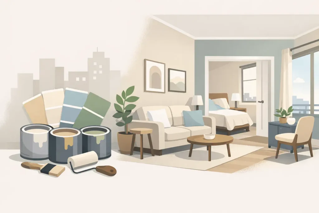
A small apartment can feel surprisingly generous when the walls stop cutting the space into visual boxes. The best paint colors for small apartments do more than look attractive on a swatch. They control how light moves through each room, soften awkward corners, and create a calmer backdrop for everyday living.
For a fast, low-disruption repaint, start with the apartment’s natural light, existing flooring, and the rooms you use most. A color that looks clean and spacious in a bright living room may turn cold and flat in a windowless hallway. The right choice is not always plain white. It is the shade, undertone, and finish that work with your actual space.
Best Paint Colors for Small Apartments: Start With Light
Light colors generally make walls appear to recede, which is why they are a dependable choice for compact homes. But “light” does not mean stark. Pure brilliant white can reflect plenty of light, yet it may also make a small apartment feel clinical, especially under cool LED bulbs or against gray tile flooring.
A soft off-white, pale warm gray, or muted neutral usually gives better results. These colors still brighten the room while adding enough warmth to make furniture, curtains, and artwork look intentional. If your apartment receives strong afternoon sun, choose a neutral with a subtle gray or beige base to prevent glare. If it has limited daylight, a warmer ivory or light greige can keep the walls from looking dull.
Before confirming a shade, view a large sample on more than one wall. Check it in morning light, at night with your usual lamps, and with the curtains closed. Paint is not static. The same color can read creamy, gray, or slightly green depending on the light around it.
Four Reliable Color Directions
You do not need a complicated color scheme to make a compact home feel polished. These four directions are practical, flexible, and easy to maintain.
- Warm off-white works well for living rooms, entryways, and apartments with limited daylight. Look for gentle ivory, linen, or almond undertones rather than a yellow-heavy cream.
- Light greige combines gray and beige for a modern neutral that works with wood, black accents, stone-look flooring, and most built-in carpentry.
- Pale blue-gray brings a quiet, airy feeling to bedrooms and study corners. Keep it soft and muted. A blue that is too saturated can make walls feel closer.
- Soft sage or dusty green adds personality without overwhelming a small space. It pairs particularly well with warm wood, rattan, beige upholstery, and natural textiles.
The trade-off is simple: the more saturated the color, the more it becomes a feature. That can be excellent for a single wall or a defined nook, but painting every wall in a dark or vivid shade can reduce the open feeling you are trying to create.
Use One Continuous Base Color Where Possible
In a small apartment, too many abrupt color changes can make the floor plan feel fragmented. A single main wall color flowing from the living area into the dining space and hallway creates visual continuity. It gives the eye fewer stopping points, which makes the home read as one larger environment.
This does not mean every room must be identical. Bedrooms can shift into a softer related tone, and a study can carry a more focused color. The key is to keep the undertones compatible. For example, a warm off-white in the living room can connect naturally to a muted sage bedroom. A cool bright white beside a yellow beige, however, may make both shades look wrong.
Ceilings deserve the same attention. In most low-ceiling apartments, a white ceiling that is slightly lighter than the walls helps lift the room. Painting the ceiling the exact wall color can look stylish in a larger space, but it may feel enclosed in a compact unit unless there is excellent natural light.
Choose Accent Walls Carefully
An accent wall is useful when it creates a deliberate focal point: behind the bed, at the dining wall, or around a compact work-from-home area. It is less useful when it is chosen simply because one wall happens to be empty.
For small apartments, select the wall you naturally look toward when entering the room. A deep olive, slate blue, charcoal, or terracotta can add depth there, especially when balanced with light surrounding walls. Avoid placing a dark color on a short wall at the end of a narrow corridor. That tends to make the corridor feel even shorter.
If you want contrast without the visual weight of a full feature wall, consider painting a recessed niche, the inside of a shelving unit, or a defined study alcove. These smaller moves bring character while preserving the bright, open effect of the main palette.
Match the Paint Finish to the Room
Color selection matters, but finish determines how the painted surface performs after handover. A flat or matte finish hides minor wall imperfections well and gives living rooms and bedrooms a refined, low-glare appearance. It is often the preferred finish for main walls where a soft, spacious look is the priority.
For kitchens, bathrooms, and high-touch areas, use a washable finish with stronger resistance to moisture and marks. These surfaces need regular cleaning, and a fragile matte finish may not hold up to daily wiping. A slight sheen reflects more light, which can help in a small bathroom, but too much shine may highlight cracks, patching, or uneven texture.
This is where professional surface preparation matters. Even a premium paint color will not look clean if old cracks, nail holes, stains, or peeling areas remain visible beneath it. Proper patching, sanding, sealing, and multi-coat application create the smooth finish that allows light colors to do their job.
Room-by-Room Choices That Make Sense
Living and dining areas
Choose a versatile off-white or light greige for the largest shared zone. These shades handle changing daylight and make it easier to update your furniture later. If the dining area feels separate from the living space, keep the same main wall color and use lighting, a rug, or artwork to define it instead of a sharp paint change.
Bedrooms
A bedroom can carry more color because it is a private retreat. Soft sage, misty blue-gray, muted blush-beige, and warm taupe all create a restful mood without closing in the room. For very small bedrooms, keep the wall behind the headboard slightly deeper and the remaining walls lighter.
Kitchen and bathroom
Clean warm whites and pale neutrals make compact functional rooms feel fresher. In a bathroom with little natural light, avoid icy white unless the lighting is deliberately warm. In a kitchen, consider how the wall color will sit next to cabinetry, backsplash tile, and countertop materials before committing.
Hallways and entry areas
These spaces are often overlooked, even though they set the first impression. Continue the living room color through the hallway to avoid a chopped-up look. If the entry has no daylight, choose a warm light neutral and use an easy-clean paint system suited to scuffs and frequent contact.
Avoid These Common Small-Space Mistakes
The biggest mistake is choosing a color solely from a phone screen or a tiny paint card. Undertones become much more obvious once a whole wall is painted. Another is selecting a fashionable dark shade without deciding where the room’s light will come from at night.
Also avoid mixing several nearly identical whites. One may look pink, another blue, and another yellow once they sit side by side. Limit the palette, coordinate undertones, and test under the lighting you actually use. If you are repainting before move-in, confirm colors early so the preparation, sealing, and application schedule can proceed without last-minute changes.
For homeowners who want the decision and execution handled in one coordinated process, Painting.com.sg can assess the space, explain suitable paint ranges, prepare the walls, and complete the repaint with minimal disruption. The goal is not simply to leave fresh paint behind. It is to leave an apartment that feels easier to live in from the first day.
Choose the color that supports how you want the room to feel at 8 a.m., after work, and when guests arrive. In a small apartment, that everyday comfort is worth more than chasing a trend.
